
A retro, modern bright red orange wordmark that says "Her Career Story" and the "o" has a retro flower shape in the middle.

Her Career Story

Project: Custom 8-Page Website Redesign & Light Branding

Client: Women’s Career Blog and Community

Project Goal: A fun and feminine website that balanced the serious nature of the blog content

Design Vibe: Retro, bold, colorful, and fun

Katharina had a great foundational website for her passion project blog interviewing women globally about their unique career paths. While the website was rich with SEO and had a good organizational base, she wanted something more colorful and lively for the design. The original design was mostly black and white with simple fonts which emphasized a more serious tone for the blog. I transformed the website by opting for a bold and feminine color palette, fonts that strike a balance between modern and retro, and fun design elements throughout.

Check out the live website here: hercareerstory.com or view the project below.

A retro, modern peach wordmark that says "Her Career Story" and the "o" has a retro flower shape in the middle.
An alternating teal and gold checkered border that also alternates a peach and gold retro flower.
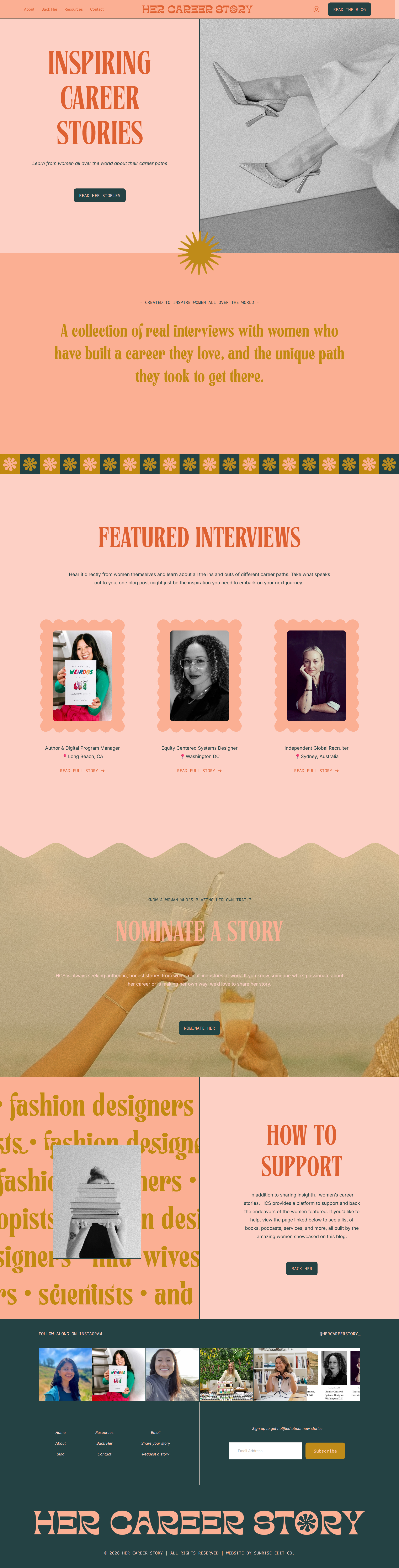
A career blog home page that alternates between light pink and retro pink sections. The sections shown are a hero linking to the blog, a mission statement section, and a featured interviews section.
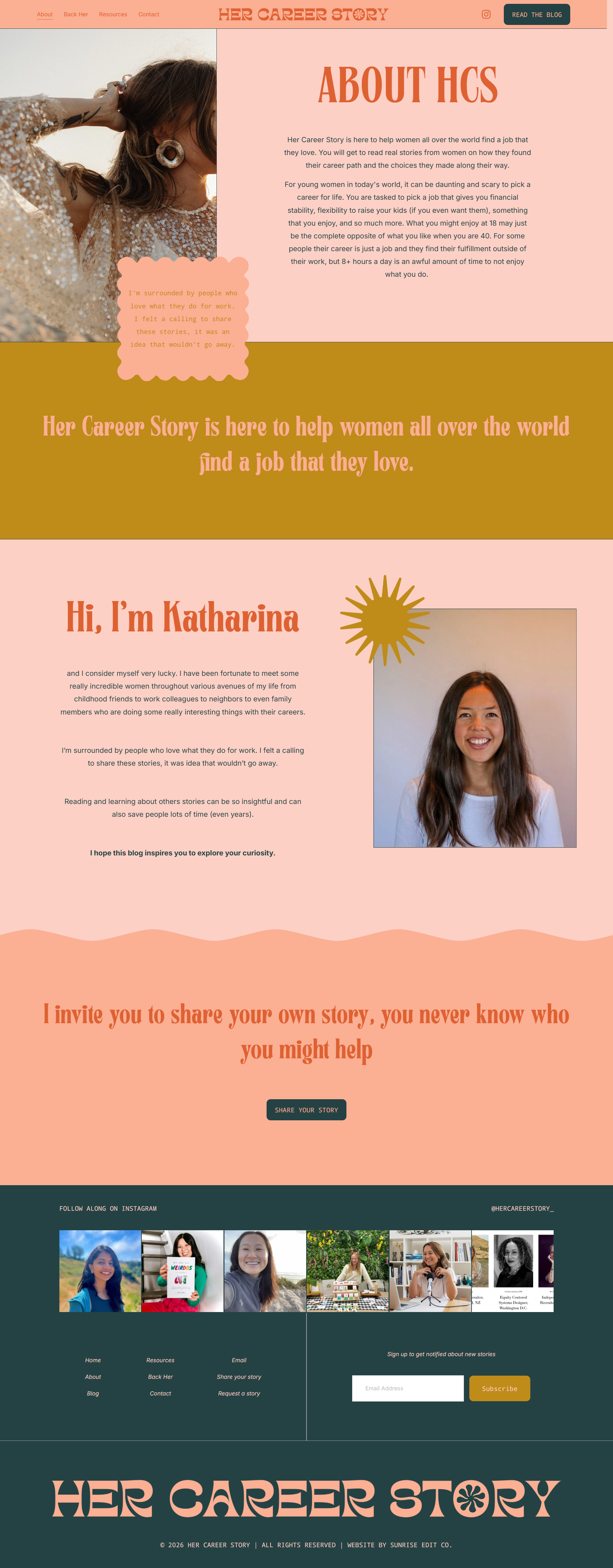
A career blog about page that talks about what the purpose of the blog is and why Katharina, the blog owner, started it in the first place. It ends with an invitation to share your own story.
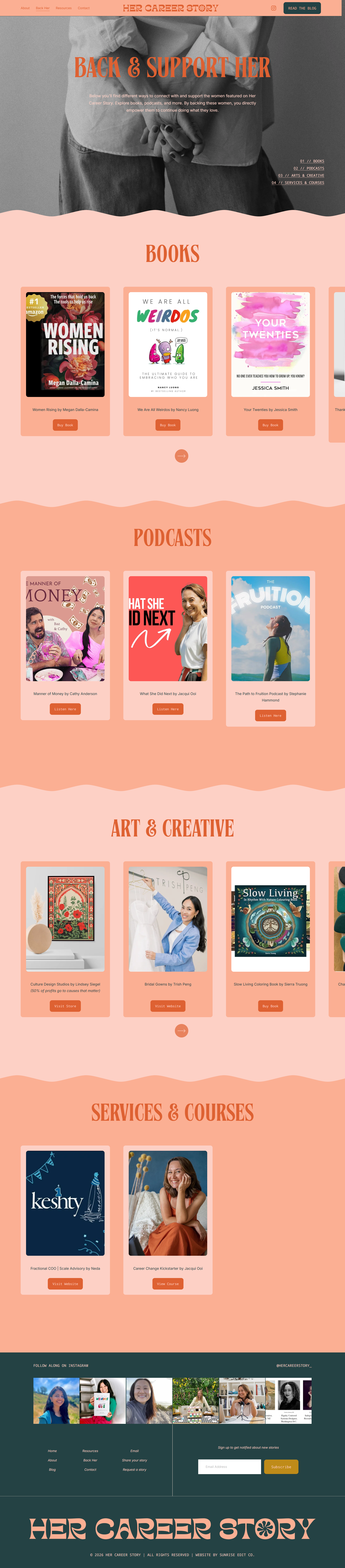
A "back her" page for the blog that lists different book, podcasts, art, and services that visitors can buy to directly support the women featured on the blog.
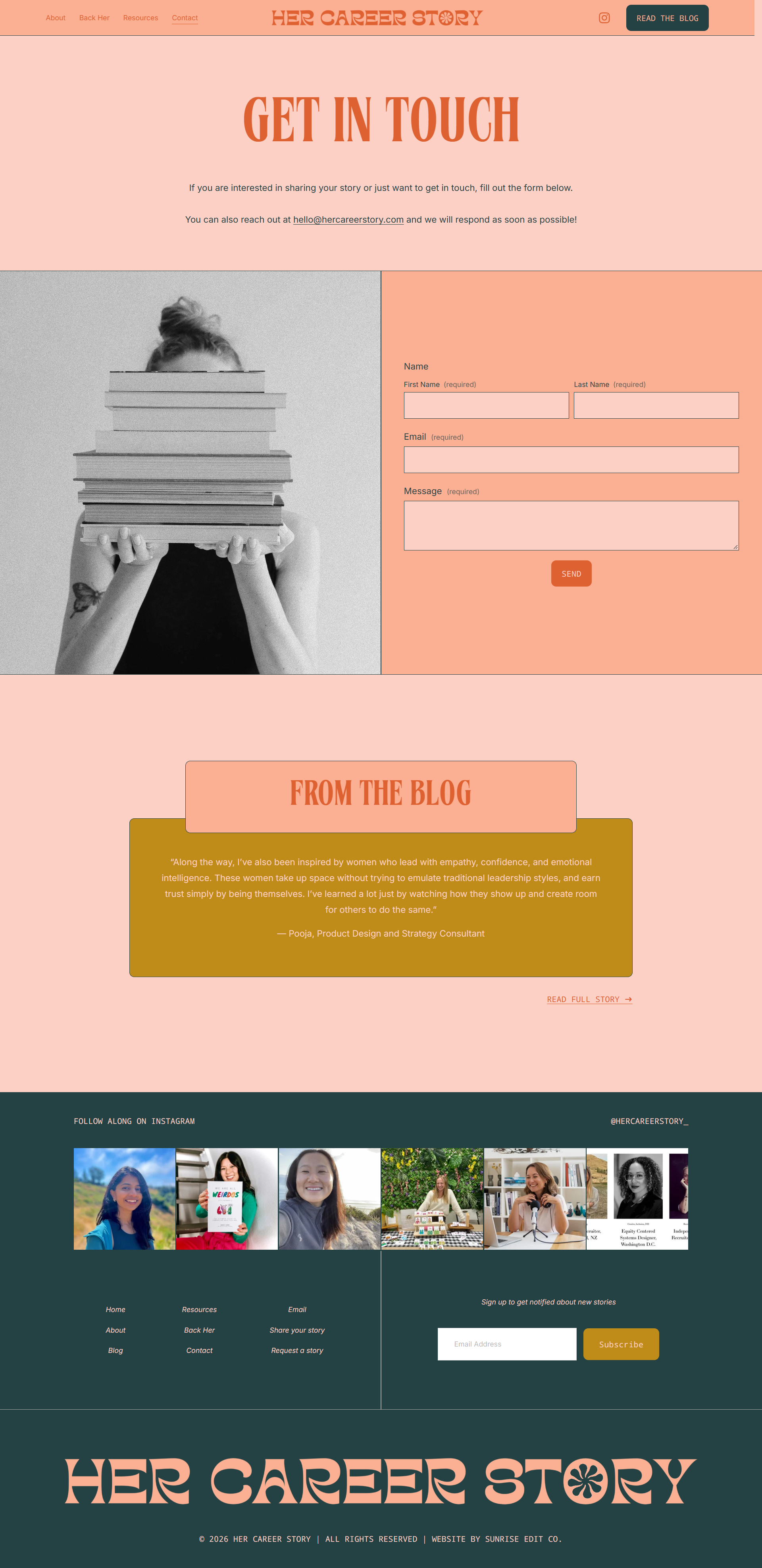
A contact page for the blog with a simple contact form and how to get in touch via email. The page ends with an inspiring quote from the blog and link to read that blog post.